How Good Typography Can Transform Your Design
Have you ever looked at a brand and instantly felt that it was premium, modern, playful, or trustworthy? Sometimes, it’s the logo that catches your attention. Other times, it’s the colors, the photography, or the overall visual style. But there’s another element quietly shaping that impression: typography.
Think about the websites you visit, the packaging on your favorite products, or the posters that catch your eye on the street. The way the text looks can change how you feel about the entire design, even before you’ve finished reading a single sentence.
Typography is easy to take for granted because we see it everywhere. Yet, when it’s done well, it brings everything together. It makes information easier to understand, gives a brand its personality, and helps a design feel intentional rather than random.
You can have beautiful illustrations, a clever concept, and a great color palette. But if the typography feels out of place or makes the content difficult to read, the whole experience can fall flat.
So, what makes typography such an important part of good design? Let’s break it down.
1. Typography Speaks Before Words Do
Typography isn’t just about choosing a font that looks nice. It’s about deciding how your message should feel.
Imagine seeing the same word set in two completely different typefaces. One is a bold, geometric sans serif. The other is a refined serif with delicate details. Even though the word itself hasn’t changed, the impression it creates probably has.
That’s the interesting thing about type: its visual personality can influence how people interpret a message.
Different type styles often communicate different qualities:
- Serif fonts can feel established, editorial, sophisticated, or traditional. They’re often used in publishing, luxury branding, and projects that want a sense of heritage.
- Sans serif fonts tend to feel clean, contemporary, and straightforward. They’re common in digital interfaces, modern branding, and communication that values clarity.
- Script fonts can introduce elegance, warmth, or a personal touch, depending on how they’re drawn.
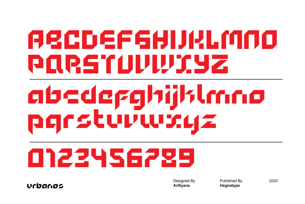
- Display fonts are designed to make a statement. They can be expressive, experimental, futuristic, or unconventional, making them useful for headlines and distinctive brand identities.
Of course, these aren’t strict rules. A serif doesn’t automatically make a brand look luxurious, and a sans serif isn’t always modern. The design of the typeface, its proportions, spacing, and context all contribute to the final impression.
The goal is to choose typography that supports the message you’re trying to communicate. When the visual character of a typeface aligns with the personality of a brand, the result feels much more convincing.
2. Get to Know the Anatomy of Type
If you want to make better typography decisions, it helps to understand how letters are constructed.
You don’t need to become a type designer to appreciate the details, but knowing a few basic terms can change the way you look at fonts. Instead of choosing a typeface based only on appearance, you’ll begin to notice why certain designs work better than others.
Here are a few essential terms worth knowing.
Ascender
The part of a lowercase letter that extends above the x-height, as seen in letters such as b, d, and h.
Descender
The part of a letter that extends below the baseline, as in g, p, and q.
X-height
The height of the main body of lowercase letters, traditionally measured using the letter x. X-height can affect how large lowercase text appears at a given font size, which makes it an important consideration for readability.
Serif
The small finishing strokes found on certain letterforms. Their shapes vary considerably, from subtle and refined to thick and expressive.
These details might seem minor, but they influence the overall texture and performance of a typeface. Two fonts set at the same size can look surprisingly different because of their x-height, proportions, stroke weight, and spacing.
Understanding type anatomy also makes it easier to evaluate fonts for specific projects. A typeface that looks impressive in a large headline might not perform as well in a long paragraph. Recognizing the difference helps you make more informed choices.
3. Font Pairing: Finding the Right Balance
Choosing a typeface for a design can be challenging enough. Choosing two or more that work together? That’s where things get interesting.
Good font pairing creates a relationship between different elements of a design. One typeface might grab attention, while another makes the supporting information comfortable to read. Together, they create a visual system that feels organized and cohesive.
Here are a few principles to keep in mind.
Look for contrast, not competition.
Pairing two fonts with very similar characteristics can make the hierarchy feel unclear. On the other hand, combining typefaces with contrasting styles can create a more noticeable distinction between headings and body text.
For example, an expressive display font can work well with a neutral sans serif. The first brings character, while the second keeps the information clear.
Give each font a purpose.
Before adding another typeface, ask yourself what it contributes. Does it create hierarchy? Improve readability? Reinforce the brand’s personality? If two fonts are doing exactly the same job, you might not need both.
Pay attention to readability.
A highly decorative font can look fantastic in a headline but become exhausting in a long paragraph. Choose typefaces according to their intended role, not just their appearance.
Keep the system manageable.
For many projects, two typefaces are enough, and three can work when each has a clear function. Using more isn’t necessarily wrong, but every additional font needs to justify its place in the design.
One useful approach is to establish a simple system: a display typeface for headlines, a text typeface for longer content, and an optional supporting style for labels or small accents.
The best font pairings don’t necessarily come from the most unusual combinations. They come from understanding contrast, consistency, and the needs of the project.
4. Legibility and Readability: Making Every Word Work
A beautiful typeface isn’t automatically a practical one.
When working with typography, two concepts are particularly important: legibility and readability. They’re related, but they describe different aspects of the reading experience.
Legibility is about how easily readers can distinguish individual letters and characters.
Readability is about how comfortably readers can follow and understand a larger piece of text.
Both matter. If individual characters are difficult to recognize, or if a paragraph feels exhausting to read, the design isn’t doing its job as effectively as it could.
Fortunately, a few adjustments can make a meaningful difference.
Font size
Text needs to be large enough for its intended context. A size that works on a printed poster might not be appropriate for a mobile interface. Always consider the viewing distance, screen size, and audience.
Line height
The space between lines helps readers move through a paragraph. Lines that are too close together can feel cramped, while excessive spacing can make the text feel disconnected.
Line length
Very long lines can make it difficult for readers to find the beginning of the next line. Keeping text blocks at a comfortable width helps create a smoother reading experience.
Letter spacing
Tracking controls the overall spacing between characters. Adjusting it can improve the appearance of uppercase headings, compact labels, or text that feels too crowded.
Kerning
Kerning refers to adjusting the spacing between specific pairs of letters. For example, combinations such as AV may need special attention to achieve a visually balanced result.
Color contrast
Text needs sufficient contrast against its background. Light gray text on a white background might look subtle in a mockup, but it can be difficult to read in practice.
These details are especially important in digital design, where people use different devices and viewing conditions. Good typography doesn’t simply look attractive in a presentation. It needs to work in the real world, too.
5. Typography Is a Key Part of Brand Identity
A brand’s visual identity is more than its logo. It’s the complete system of visual choices that makes the brand recognizable across different touchpoints.
Typography plays a major role in that system.
Think about how different type styles can communicate different brand personalities. A fashion label might use a high-contrast serif to create an editorial feel. A technology company might choose a geometric sans serif to support a clean, contemporary identity. A playful consumer brand could use rounded, expressive lettering to feel more approachable.
The important thing isn’t following a particular trend. It’s finding a visual language that makes sense for the brand.
When selecting typefaces for a brand identity, consider these questions:
- What’s the brand’s personality? Is it serious, friendly, adventurous, refined, or experimental?
- Who is the audience? The visual language should connect with the people the brand wants to reach.
- Where will the typography appear? A logo, website, product label, and social media campaign have different requirements.
- Will the typeface remain useful over time? A distinctive design can help a brand stand out, but it should also support consistent communication beyond a single campaign.
Consistency is another important factor. When typography is used thoughtfully across websites, packaging, presentations, and marketing materials, it helps create a recognizable visual identity.
This doesn’t mean every piece of communication must look identical. It means the type choices should feel as though they belong to the same brand.
For designers, this is where choosing the right typeface becomes more than a styling decision. It’s part of building a visual identity that people can recognize and remember.
6. What Happens When Typography Goes Wrong?
Poor typography doesn’t always look obviously terrible. Sometimes, the problem is simply that something feels off.
A heading might be difficult to scan. A paragraph might feel too dense. A font might communicate a personality that doesn’t match the brand. Individually, these issues may seem small, but together they can weaken the entire design.
Here are a few common consequences.
The message becomes harder to understand.
When text is difficult to read or poorly organized, people have to work harder to find the information they need.
The brand feels inconsistent.
A typeface that clashes with the brand’s personality can create a disconnect between what the business says and how it presents itself.
The design loses its visual hierarchy.
If every element competes for attention, readers may struggle to identify what’s important and where to look next.
The user experience suffers.
On websites and digital products, confusing typography can make navigation, reading, and interacting with content less comfortable.
The design may become less effective.
When people struggle to understand a message or lose confidence in its presentation, a campaign or website may have a harder time achieving its goals.
Good typography can’t guarantee business success on its own. But it can remove unnecessary friction, support clear communication, and help a brand present itself with greater care.
That’s why typography deserves attention from the beginning of a design project, rather than being treated as a finishing touch.
7. How to Make Better Typography Choices
You don’t need complicated rules or an enormous font collection to improve your typography. Often, the biggest improvements come from making a few deliberate decisions.
Start with the purpose of the design. A typeface for a magazine headline has different priorities from one used in a mobile app or a product label.
Next, think about the message. Should the typography feel technical, elegant, friendly, bold, or understated? Let those qualities guide your initial selection.
Then, test your choices in context. Don’t evaluate a font using only a specimen or a single word. Try it in actual headlines, paragraphs, labels, and layouts. Pay attention to how it behaves at different sizes.
Finally, review the complete system. Check whether the fonts work together, whether the hierarchy is clear, and whether the text remains comfortable to read.
Most importantly, don’t choose a typeface simply because it’s popular. A font that works beautifully for one brand might be completely wrong for another.
The right choice is the one that supports the design’s purpose while giving it the character it needs.
Final Thoughts: Great Design Starts With Thoughtful Typography
So, is typography the most important part of design? There’s no single answer. Layout, color, imagery, composition, and many other elements all contribute to the final result.
But typography connects these elements to the message itself. It shapes how information is presented, influences the mood of a design, and helps people navigate what they see.
That makes it much more than a decorative detail.
Whether you’re designing a brand identity, building a website, creating packaging, or working on a simple poster, take the time to consider your type choices. Look beyond the initial impression and think about how the typeface behaves, what it communicates, and how it supports the overall experience.
And if you’re exploring fonts for your next project, don’t be afraid to look beyond the familiar options. The right typeface can bring a fresh perspective to an idea and help a design feel distinctly its own.
Great typography isn’t about making words look pretty. It’s about making every visual decision work together.
Explore the Hegiratype collection to discover typefaces for your next branding, editorial, or creative project.
One Comment
A WordPress Commenter
Hi, this is a comment.
To get started with moderating, editing, and deleting comments, please visit the Comments screen in the dashboard.
Commenter avatars come from Gravatar.